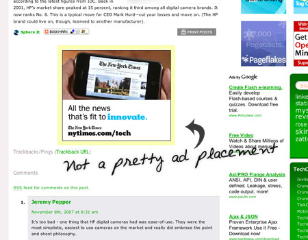
As most designers out there, I think ads suck. They’re ugly, they mess up my carefully chosen color scheme, and sometimes they are exactly everything that a designer think is bad taste.
They are also a necessary evil. I won’t begrudge anyone making some money, they can’t afford me otherwise.
Designers like to blame ads, and their clients overall actually, for messing up their designs. However, while that certainly can happen, I think it’s bullshit.
A good design have good ad spaces, the designs are either an integral part of the design, or exists outside of it. Sure, an ugly ad is an ugly ad, but you’ve done your part – as a designer – to minimize the damage.
Take a look at ad-pimped TechCrunch, and the top banner. Or the square between post and comments. While both ads are spotted right away, no doubt the purpose for the advertiser, they look thrown in there and that’s plain ugly.

Do you get a better result if you slap on ads like this, like the square between the comments and the content? Maybe you do, but you’re hurting your brand. That might be a hit you’re willing to take, it depends on what kind of site you’re operating, but to me it’s an unnecessary thing to do.
Take ads into account when doing the design and you’ll be fine. And if you need to place a different ad size on your site, well, change the design to accommodate it.
Originally posted on November 9, 2007 @ 6:41 am