This is a topic that, in one way or another, has been touched on by many designers and meta-bloggers alike; that is, formatting your post to make it more readable. Regardless, people still continue to ignore this advice. Now, lets make this clear; I am not talking about just a better design. You can have a relatively lifeless, boring design, while still making your posts clear and readable (think of the old Copyblogger design). That is what I am focusing on here.
First Steps to Take
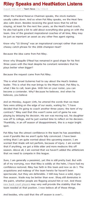
As an example, I am going to use a post from my sports blog, Miami Heat Wired, as an example. Lets take a look at it:

Now, one thing that this post already has, which is key, is a bit of height between the lines. This is one of the first things you should be doing when you are trying to make your website more readable. Unfortunately, this is the only positive about the post so far. So now, I can walk you through making this post a surefire winner; and note, that I will not be adding any content to the article. The actual body will remain the same.
Use those Headings!
They come styled and built-in to every one of your themes! Why don’t people use them!? Not only are they beneficial for search engine optimization, but they also serve as little breaks in your article. Having one solid page of text can be downright tedious; your reader will not appreciate that. Headings also make it easy to scan your post which is always a benefit.
And as I mentioned before, you don’t have to do much work, since the styling is usually prebuilt into any template you can find. So just come up with some headings and sub-headings and then wrap your text in <h1>, <h2> or whatever other level you want.
A Picture is only worth 87 words
OK, seriously, you should be using pictures in your posts. However, do not make the mistake of thinking that pictures are somehow worth 1,000 words; the actual article should be the focus, while your picture highlights some particular element; adding flavor to the soup that is your post.
And while we are at it, make sure that you style your pictures, but only subtly. Make sure that you align them with CSS and also add a border of some sort, when it is called for. Even a caption or two is desirable. These little details can go a long way.
Pull your Quotes right out
An oft ignored text-formatting element is the pull quote. Everyone knows to use block quotes as a way to highlight, well, a quote. And while this is a good technique to use, you should also try a pull quote every once in a while. The issue is again scan-ability, with the reader being able to see certain elements that you want to highlight. And since they are not often used in blogs, yours will stand out.
As for execution of this style, here is an article from Sitepoint that describes the CSS you can use to make pull quotes. But if you don’t want to deal with that dirty work and you have WordPress, you can just use this plugin.
So how does it look?
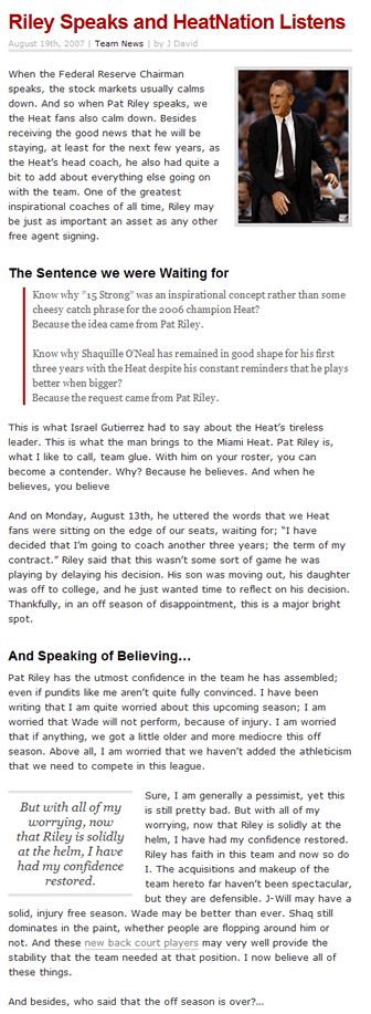
So, using my own advice, I applied the previously mentioned techniques to my original post from Miami Heat Wired. Here is what I came up with in the end:

Now isn’t that so much better?
This post was written by J David Macor.
Originally posted on August 19, 2007 @ 10:55 am