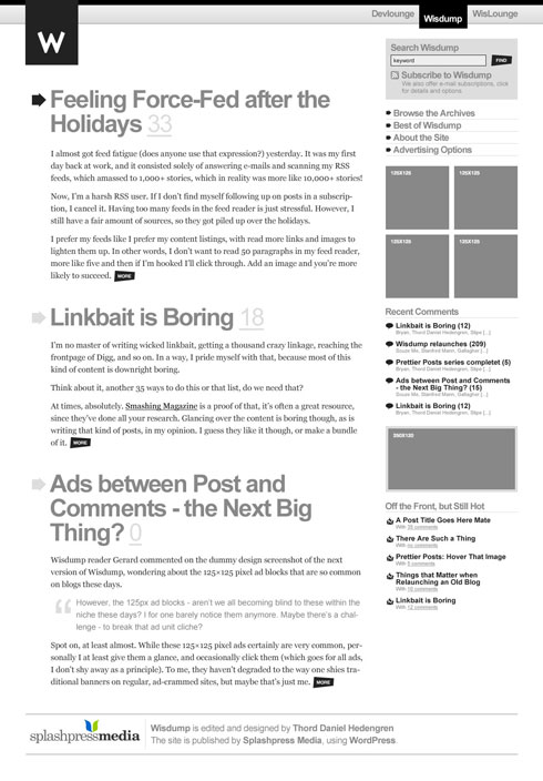
I’ve finally decided which design I’ll work with for the next version of Wisdump:

It won’t look exactly like that, there’ll be some fixes in the sidebar, change in the whitespace, and some other things that might or might not appeal to the grid fanatics out there, but it’s a start. Actually, it might differ quite a bit, it sort of depends on how things work out for real, and what I finally decide to put in there. You see, mockups for clients are one thing, but this is a project where my word is final (although I obviously want to hear from you guys, the readers), even though I don’t own Wisdump. So we’ll see how close I’ll be to this mockup, some things will change for sure, like the slanted button design.
Do check out the three redesign concept posts if you’re interested.
Originally posted on February 29, 2008 @ 7:20 am