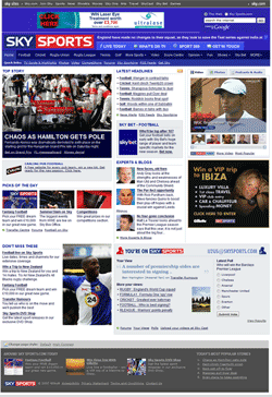
 When Skysports launched their redesign 2 weeks ago, they’ve forgotten one thing. The new CSS-based design is visually appealing, and contains everything one expects from a modern news portal. Enough of whitespace, integrated social bookmarking links and comments. But it lacks in one area: usability.
While the page height has been drastically reduced all over the platform, it has become much harder for the reader to easily navigate the platform. The old homepage was only 400 px higher, had less whitespace, but offered more.
Before, your typical nuke left sidebar offered many different configurations, depending on where you were on the side. The left sidebar has been replaced with a modern header navigation, but a header navigation with some elements in a JS drop-down navigation and other elements in dropdown boxes. More clicks for the user.
On the main and section pages less stories are listed, thus making navigation for people interested in headlines harder.
Bad become both problems on the subpages. Obviously the most popular sport for Skysports, football – soccer for Americans and Beckhams – is the best example of this. Many leagues and headlines were listed on the former football page and the old fashioned left navigation bar offered a quick navigation to the different league pages. Today only some headlines and stories are linked anymore and the leagues have disappeared in a dropdown box.
The design team of Skysports has done a visually appealing job but forgotten that there is no fold! Internet surfers are used to scroll pages nowadays and the great article Blasting The Myth Of The Fold, by Milissa Tarquini, Director of User Interface Design and Information Architecture at AOL, proves that not everything has to be stuck in the little area above the fold, with a practical example: on the 2500px high, now retired, AOL News Daily Pulse one poll at the bottom of the page had more than 325k votes!
Footer design has become a very important part of actual webdesign. Many navigational items are nowadays found in footers. Give the reader something when they arrive at the end of the page. They have thought about a footer area, but the footer can heavily be improved with useful content.
Clearly the Skysports designing team has missed the last 12-18 of web design evolution. Maybe someone can pitch them Roger Johansson’s 456Bereastreet. They might as well learn that the propagation of horizontal design implementation of horizontal scrollbars doesn’t improve the accessibility of any site.
The Skysports redesign, a perfect example of how modern design could make your site less usable.
Originally posted on August 14, 2007 @ 3:39 pm