Read/WriteWeb is a great site, content-wise, I read it from time to time – I especially like Marshall Kirkpatrick’s writing style. Actually, all sites in the RWW Network, being Last100 and AltSearchEngine, as well as the podcast Read/WriteTalk, all reek of quality. That’s nice.
What’s not as nice is the design the flagship site, Read/WriteWeb sports. It’s a fairly new one, and a real downgrade if you ask me. I’ll tell you why.
First of all, the header is uninspired. I really dislike the logo, but the worst part is that it feels so simple that it borders to amateurish, instead of simple in a good way. The subscribe options to the right, and the color usage (red being their brand color) is OK, but the menu and search box is dull. It’s just a poor header, which surprises me.

The main content area is user friendly, with a top story to the left, and popular posts to the right, and ads to the far right. Three featured posts go below the first main post area, all very accessible, and that’s fine. It’s no eye-opening design, but it’s clean and simple in a way that works.
 I like the recent comments positioning to the right of the ad. I also like the post listing that follows. Good use of images as well, although they don’t really work as well in single posts.
The sidebar is OK. Ads mingled with things that might interest readers, but it should have something more to make it more appealing. Now you can actually skip it without losing any serious functionality, a bad thing as regular Wisdump readers well know.

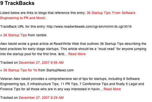
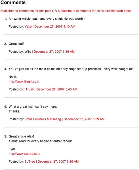
The content part of single posts is good, but trackback management is poor at best, and the comments are downright ugly.

Such a strong brand, and profitable site (I gather?), as Read/WriteWeb should really do better than this. Surely they can afford to hire a designer to spice this verison up a bit, that should do the trick. Redo the header (and kill that logo please), spice up the comments, move some stuff around to vitalize the sidebar, then you’re there.
What do you think about the Read/WriteWeb design?
Originally posted on January 25, 2008 @ 12:39 am