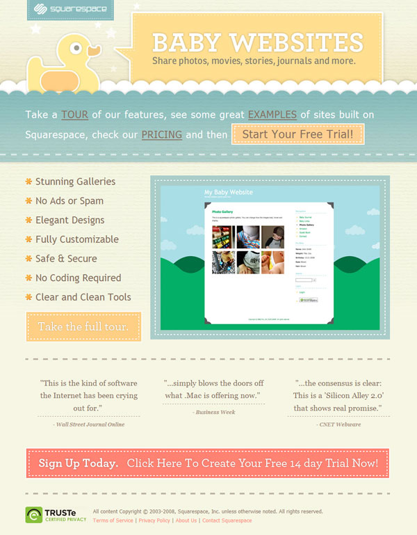
Baby Websites is a pretty interesting proposition. It’s a sub-section of hosted blogging platform Squarespace that caters specifically to the doting parents who want to show off their babies online.
The praise given by Business Week on the homepage reveals the competition Baby Websites is up against: .Mac. Sure, one can compare it to the rest of the blog software out there, but Baby Websites and .Mac pride themselves in more user-friendly interfaces and easier customization for a price.

But that’s where the similarities end. The design of Baby Websites is Squarespace’s arrow that aims squarely at the target market. For once, the design of an Apple product looks like an afterthought! After you have seen Baby Websites, the .Mac website will look only satisfactory especially since it inherited its look from the rest of Apple.com.

Of course, it’s the inside that counts. And Apple’s consistency with its subsites is no small feat. But you cannot discount the effects of pretty packaging. Apple knows that well. But good design is not just about making beautiful things. It’s also about purpose.
If I am a mother looking for a publishing solution for my baby’s website, which site will I seal the deal with? I would definitely prefer a product that shows exactly what it can do upfront. More moms will go, “I want to make a site that looks like that!” rather than examine all the pretty icons, specs, or videos one by one.
The .Mac page looks a bit too overwhelming for blogging newbies. Sure, it has great graphics and its features are neatly arranged in a grid, but that’s it. It’s just sitting pretty like that. Again, it now looks mediocre because exactly because it’s following a design convention it wasn’t meant to follow if it was supposed to appeal to its audience.
The first time I saw Squarespace I was enamored by it. Since then, I often find myself surprised whenever I discover a blog hosted on Squarespace for the simple reason that it looks different from the themes on the more popular blogging systems. Even the custom-designed ones seemed to carry the same airy, whitespace-filled aesthetic the default templates have. I believe a baby website is the perfect place to transfer that aesthetic, and Squarespace is an expert at it.
Originally posted on April 23, 2008 @ 7:15 am