say something

Wisdump redesign concept, part 3

First of all, I’d like to give a big thank you to all of you who’ve been speaking up on the two redesign concepts I’ve posted. Your comments are appreciated, and - as you’ll hopefully will see - duly noted. I don’t always agree, but then again you won’t agree amongst yourselves either, so that’s fine. What would design be without a bit of controversy, eh?

That being said, the third redesign concept is here, with two different W logo solutions, and a brief explanation regarding the slanting design that you apparently either like or dislike.

So let’s start there. The whole idea with the slanting block behind the W logo, which I incidentally would like to preserve, is to reuse the form throughout the design. I don’t like to overuse forms, but this one resurfaces in submit buttons, read more links, and so on - both of those are in the concept, as you’ve probably seen. This brings life, not only sticking to the expected rectangles (or rounded corners, not many of those here, and that’s not just because I think they’re overused in design today).

In short, the slanted elements bring character to the design, because they are irregular. That’s more needed since the color scheme is almost non-existant.

Speaking of which, I do intend to use colors for hovering links, and, as been pointed out in the comments, strong images for headlining posts will certainly stand out in a design like this. I’ve made the content area a little wider than I perhaps would have under other circumstances, to give more playroom for images. I don’t think the white, grey, and black scheme will be dull, because images will lighten it up. And ads of course, although I won’t rely on them to add color.
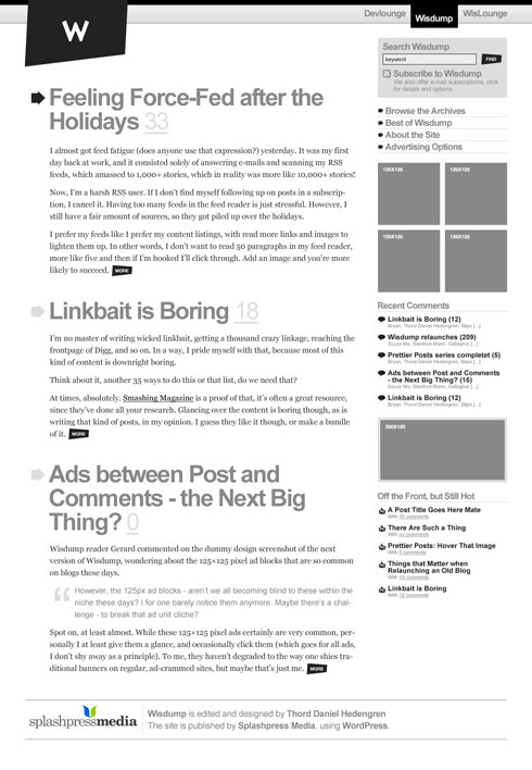
The concepts

Enough talk! I’ve got two concepts with different logos below. They are not final, but I’m starting to feel comfortable with them, which is important since I’ll be sticking with the new design for quite some time. It’s the front page we’re looking at, no images in the mockups, you’ll have to imagine those. A simple footer have been added. Naturally, there should be more posts in the listing, I’d say five instead of the three, but I didn’t want to make the images too big.

First concept, with slanting logo design.

Concept 3, slanted

Second concept, no slanting logo, just a simple rectangle plate falling down from the top.

Concept 3, rectangular W dropdown from top

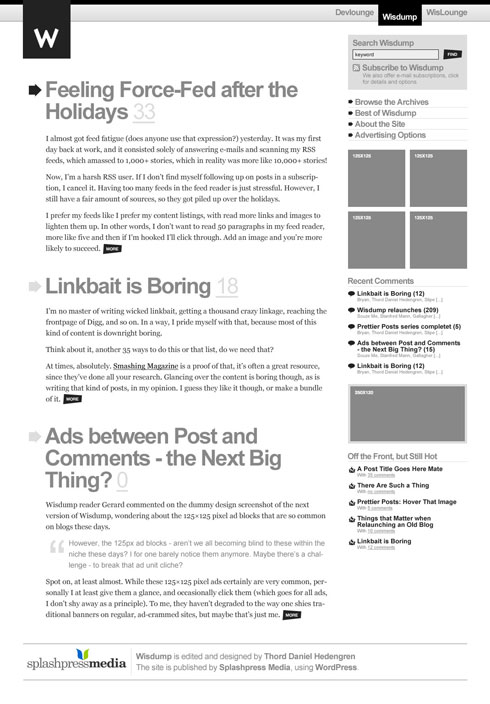
As you can see, no circular version. It just doesn’t fit into this design as it does in the current one.

What do you think?

9 people says things!

  1. The first one of these two is best, the angled background shape behind the logo is really growing on me. I think the rectangle one (the second one) is too plain. I also like the consistancy of the shape throughout the site; makes it like a trademark for the blog.

    The large headings for the posts completes the look. Not sure about the color scheme, adding one accent color for headings and such might not be a bad idea to play around with.

    It’s looking good!

    By Alexander on January 26, 2008 3:55 am

  2. I would choose first one, but If you decide to go with the second one, i think you should remove those irregular forms from the buttons.

    By diogo on January 26, 2008 5:01 am

  3. This comment was initially posted on:
    http://wisdump.com/design-critiques/design-critique-readwriteweb/

    However it also has some feedback on this design, so I copied it over to this post as well.

    —————
    No. I don’t work for RWW. I have been following wisdump since it’s 9rules/scrivs days. My point is really that if you are going to publicly criticize someones work you should make sure yours is spot on.

    In the case of the latest (v3) sample of the wisdump design concepts…where is the grid? Look at the sidebar and look at how many seperate vertical margins exist. Look at how many horizantal margins exist…why is the top of the sidebar above the main headline for the first content item?

    The point is not just that the redesign is shit. The point is that it takes big balls to criticize someones work when your own work is so lackluster and un-inspired. The thing is RWW probably does not care what wisdump looks like…no one has since scrivs sold it.

    By Stephen on January 26, 2008 5:02 am

  4. I like the new designs. Just tried to send you a message via the contact form but it created a fatal error. Can you get in touch?

    By Richallum on January 26, 2008 11:23 am

  5. I still prefer the slanted look. It gives wisdump a magazine feel. Is that what you want? I would either extend it so that the you-are-here wisdump at the top is also slanted or does not contrast with the slanted logo.

    Staying with the top site nav, it doesn’t line up well and really needs changing, imho. Perhaps have Wisdump further to the left when it is current and the other two aligned with the sidebar.

    By 01010 on January 26, 2008 11:40 am

  6. I know you want to make it look good, but I doubt if you’re considering usability enough.

    1. The post titles are too big, visitors cannot see it at once, they have to try. Because of the large vertical space it takes up, visitors with smaller screen sizes (eg laptop) only get to see the first post, or maybe just a piece of it.

    2. Because everything is gray and toned down, the only things that will catch users attention are the “More” buttons and your full colored flashy adverts. I think your latest post should attract all the attention.

    Apart from that; great design, except I’m missing the visuals for each post, since you yourself wrote: “images are great for making longer blog post seem more attractive”

    By Niek Kouwenberg on January 27, 2008 5:38 am

  7. I like the slanted one as well, good idea 01010 re: the network slanted marking. Personally I don’t care about this grid thing at all. If it looks good I’m fine with it, and this looks good. Maybe add one color though, or maybe not.

    Niek’s got good points, but at the same time I think people on smaller screens will have to adjust to scrolling more. You can’t please them all.

    By Fantan on January 28, 2008 6:45 am

  8. Slanted!

    By jason on February 1, 2008 4:27 pm

  9. […] check out the mockup of the proposed, and later selected, redesign. It’s not final, not at all, but it gives a taste of […]

    By Redesigning Wisdump | tdhedengren.com on March 4, 2008 9:04 pm

  10. Subscribe to comments via RSS!

    What do you think?