2006 was the year of Web 2.0 design and pretty much that type of design got old real quick. Below I have listed the Top 7 Freshest Designs in my mind that I have come across this year and although these kind of lists can easily be argued, I try to provide you with enough reasoning behind my decisions.
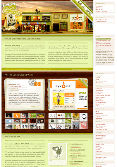
- Cuban Council
Why choose a site that wasn’t even designed in 2006 as a fresh design for 2006? In a year where we saw a return of the one-page layout, I still find that Cuban Council’s timeless design outdoes all-newcomers in not only providing a rewarding experience, but also a helpful one. Everything you need to know about them is on one page and it doesn’t seem too long or overbearing on the user. Instead the site draws you in even deeper and you begin to wish that there was more to it, not because you need to see more, but because you want to see more.
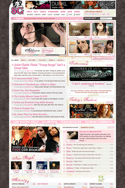
- Suicide Girls
Another site done by the guys over at Cuban Council and to me is the best community-designed site around. Mike and I were going over the site yesterday and its amazing the attention to detail the design has received. Every section of the site is designed with a purpose and if the naked pictures of women and great community weren’t enough to draw you in, then the design should finish the job.
Be sure to checkout my previous article on SG, The Genius of Suicide Girls.
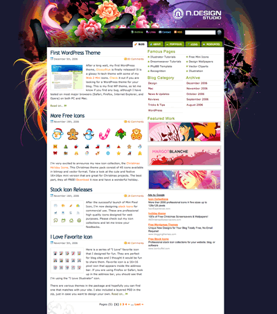
- N.Design Studio
Taking just a glance at the layout you can see there is nothing special about it. A simple two-column layout which has become the defacto layout of all sites since blogs hit it big. What you get though when going through the site is to see the work of a true artist. There are talented designers and then there are talented artists and rarely are we subjected to both on one site at once. I can only hope we see a bit more imaginations going wild on the web in ’07 with regards to illustrations.
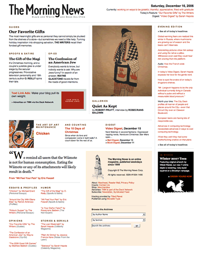
- The Morning News
Not a design that will garner many design awards, but that does not take away from the fact that it deserves some attention. The Morning News design lets you know one thing as a reader and that is the site is all about content. The design enhances the experience and stays out of the way and this is very refreshing in a period where people associate successful content sites with the amount of ad space they are selling.
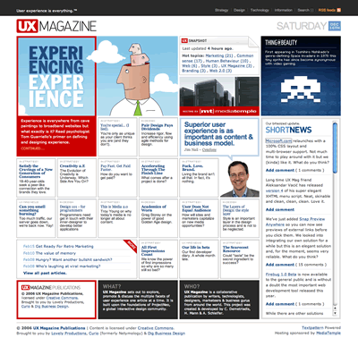
- UX Magazine
Like The Morning News, UX Magazine is focused on just giving you content. The homepage design is a brilliant use of a grid system along with a flexible-width layout. The layout adjusts depending on the size your browser window without taking away anything from the homepage. Although this type of system puts a stranglehold on how you must present your content and what type of content can fit within the site, I still think it is a brilliant use of different design elements.
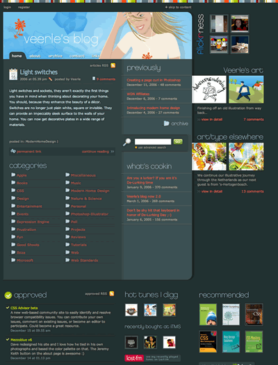
- Veerle
I almost started off this sentence with “one of the best female designers around”, but quickly realized that is my male mind kicking in and not giving Veerle her due respect. She is one of the best designers on the web and her site is one of the top five design blogs on the web in my opinion. Nothing beats great content and a great design and no other site in my mind epitomizes this relationship more than her’s.
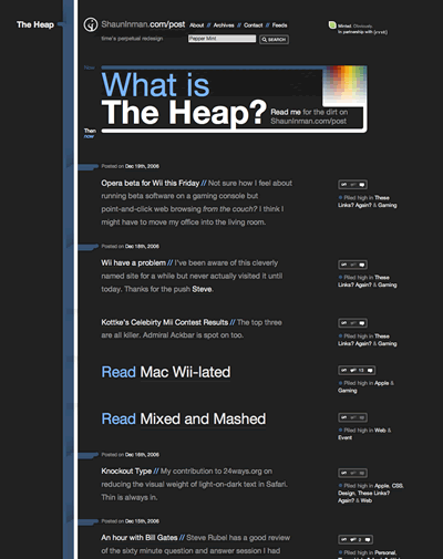
- Shaun Inman
Never one to shy away from experimentation, Inman gives us what we most want from a blog…the content. In a perfect world there are no ads, but we don’t live in that kind of world yet for the time being we can escape to the land of make believe when visiting Inman’s site. A mix of links and articles the flow is never broken and you will never have a problem reading what is on the page.
Here’s to 2007 and a whole new batch of fresh designs.
Are you seeking for some cheap web site hosting plans for your newly designed web sites and also want to get free domain registration with your hosting packages? Now you can get required web hosting package for your web site business while sitting in your room by utilizing the credit credit card processors system. You should also concern a reliable and affordable company to get the daily backup of your online data and if you are tired of your dial up internet connection and want to get ride of it then hire a broadband access to internet which is more effective and useful to use. Develop your online business by adapting the new internet marketing ideas.
Originally posted on December 20, 2006 @ 1:13 am
