Static Versus Motion Typography
In print and web design we spend a lot time trying to nail text down – to make it speak through its arrangement on the page, the selection of font, kerning, leading, space. Motion typography poses an entirely different set of challenges that simultaneously draw on these design concerns, while throwing a whole batch of other decisions into the mix.
Motion typography as it exists today largely takes place in three dimensions – we have come to expect video to create the illusion of depth, unless a particularly super-flat approach is being foregrounded stylistically. Motion typographers have to consider not just the x and y positioning of text, then, but also its positioning within the z axis. Add to that the obvious need for animation – the transition from place to place, but also from form to form, and you have a dynamic array of concerns to deal with.
In these four examples of motion typography in action, I have focused on examples in which the typography is the star of the show. Obviously, in the age of a million motion cut scenes, lower-thirds, station idents and commercials motion typography exists in a vast range of forms. These examples all push text and language play to the center of our attention, using four distinct approaches:
- Literal illustration of language
- Rhythmic embellishment of language
- Personification of language
- Polymorphous disruption of language
Literal Illustration Of Language
The first approach to bringing text into motion is to create an interplay between the meaning of the words and their literal form. Now obviously typography in any format is all about wedding meaning, or at least context, with form, but in this approach the text itself is animated in such a way as to expand on or embellish its semantic significance.
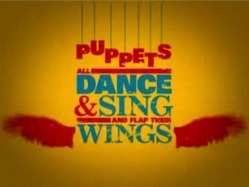
In this first example, from Liqueoum, we see some very well executed examples of this literal mode: the word puppets hangs on a series of strings, the mention of flapping wings in the accompanying soundtrack leads to wings sprouting from the word on screen – in short, the meaning of the words is reinforced by the addition of animation.
Rhythmic Embellishment Of Language
Where there is motion, there is inevitably rhythm. But some approaches to motion typography foreground the significance of rhythm more than others, translating text as a visual counterpoint, a dance partner, to the beats, music or spoken word of the soundtrack. Here the focus is much less on semantics – while the words still spell out the lyrics or spoken word they are layered and animated more to translate the temporal dimension into text than the semantic.
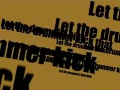
In this next example, Artur Dimke creates a great example of a rhythm-led motion typography arrangement. Here we see text layer over text, at points entirely illegible, but reacting with pinpoint precision to the flow of the track being illustrated.
Personification Of Language
Just as the typography process in print and web media place a great deal of focus on illustrating the character or concept of a brief, motion typography relies on the careful selection or design of suitable fonts and placement to get the message across. Going a step further, however, the element of motion can provide an effective way of personifying, and differentiating voices in text.
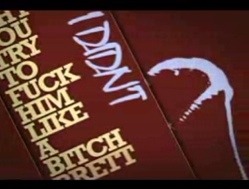
In this next well-known example, Jarratt Moody draws on both the previous two approaches, while creating a powerful dichotomy between the two speakers in a piece of dialogue from the movie Pulp Fiction. Here we see the differences in power, status, emotional state – the whole gamut of psychosocial dynamics between the two speakers – directly translated into their typographical form. I particularly love the paint spatter effect as desperation and terror creep into the second character’s voice.
Polymorphous Disruption Of Language
 This final example is the one that excites me most, as it seems to me the very essence of motion typography allowed to run totally wild. Yes, rhythm, literal and metaphorical illustration and personification all play their roles here, but overriding all of them is the very instability of language rendered directly through text.
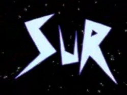
In Petra Mrzyk & Jean-François Moirceau ‘s music video for french artist Katerine, we get to see an amazing breadth of freeform typography, as words literally fly out at a breakneck pace, and exist for the briefest time in constant, polypmorphous transition. Here traditional typography is thrown out of the window – there is never really a point at which any one frame of the video might be taken as a fixed point or final version of the motion fonts being used. The emphasis is on the motion itself, the continual process of change, the fragile shifting nature of language.
Blurred Boundaries
Obviously each of the examples above have more than trace elements of one another’s approaches – the very nature of motion typography, especially as wedded to music or the spoken word – demands that it takes some stance towards rhythm, the literal or metaphorical position taken regarding semantics, the personification or conceptualization of text, and of course the need to animate and set in motion typographical design elements.
Nevertheless, what we have here are four distinct approaches to which of these elements are pushed to the fore. Four approaches that distinguish key differences between the print/web perspective on typography, and that taken by those putting it into motion.
Michael Pick is a web videography hand grenade. But a nice hand grenade, like the one the Diane Arbus kid has, or the pop art grenade from The Invisibles. You can track his latest doings over at michael-pick.com should the urge arise.
Originally posted on August 31, 2007 @ 6:18 am


