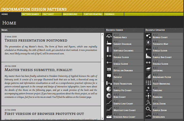
Perhaps one of the most well-designed and organized compilation of information design patterns, this website created by Christian Behrens is actually part of his master’s thesis.

It’s designed in Flash, which makes it a lot easier to demonstrate the non-static design patterns (e.g. layering) as they change over time. One can also look up the patterns according to different characteristics (e.g. order principle, user goal, graphic class, number of dimensions).
Anybody who wants to learn the variety of ways to present data—it’s a very elegant craft if it’s done right—should go visit this website. Truth is, Christian is not the first to come up with such a site, though he certainly did an awesome job with it.
User interface design is not the same as information design, but in several environments they can go hand in hand. Yahoo! has its own Design Pattern Library, which provides examples using the YUI Library and Yahoo! sites themselves. UI-Patterns.com is another such site. Even Chris Messina used a Flickr photoset as a repository for them (along with other equally useful collections: user flows, applications, etc.). Another personal project is this pattern library by Martijn van Welie.
Clearly, there’s a growing need for websites that would prove useful to information designers and interface designers. Perhaps even other types of designers. The problem is what’s out there right now are difficult to update and not exactly open to external contributions, mostly because they’re personal creations done during someone’s spare time. They’re dead ends. There is no way for other people to come in and suggest new patterns, or even share code, images, videos, and links that can help demonstrate them. There is no growth, no learning, no exchange of ideas. No community.
Design patterns keep people from reinventing the wheel, but all these collections of design patterns are redundancies themselves.
Am I looking for yet another niche social network like tlbox? Or a whole new breed of “inspiration” and “showcase” websites? Hey, if somebody can create a website with over 1 million user-generated colors, why not add another weapon to the designer’s arsenal? Move over, CSS, it’s time for ID and UI (or UX, or UIE, or whatever) to shine!
Originally posted on May 6, 2008 @ 3:26 pm