Recipe sites have this tendency to cram so much stuff on their pages that instead of being helpful, they get in the way of finding the perfect dish for that meal you’re planning. These sites, however, are redefining the culinary experience by providing beautifully-designed and user-friendly experiences on the web, and hopefully in your kitchen.
Gojee
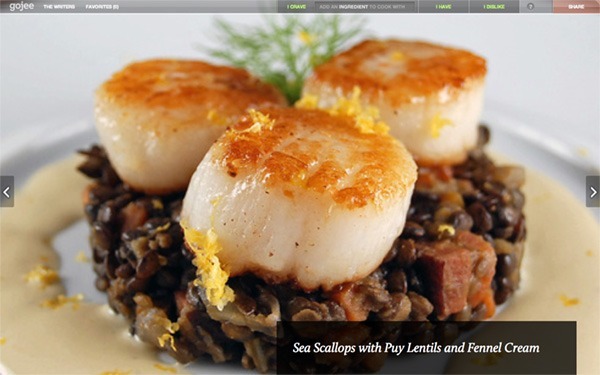
Gojee is all about personalization: you have to be signed up to their website to take advantage of its features. Enter the ingredients you “crave”, “have”, and “dislike” to get a list of handpicked recommended recipes, whose photos are displayed in full. You can browse back and forth using the arrows on either side of the page, or the arrows in your keyboard—the up and down arrows toggle recipe details at the bottom right. The use of translucency and large imagery gives a stylish, high-end feel to the site.
Recipe Finder
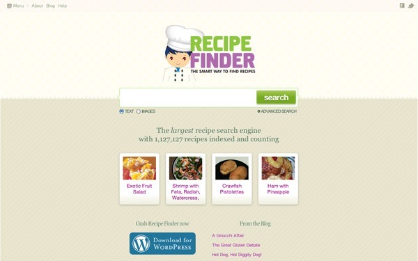
Recipe Finder takes the Google approach to finding recipes through a minimal search engine interface with an almost playful look between its cartoon logo, polka dots, and stripes. You have the option to view recipe results as text or images, and narrow them down with advanced filters. Meta information such as calories, servings, and preparation time are also listed.
Recipefy
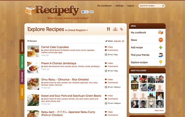
Recipefy is built on the contributions of its community and other social aspects, like inviting friends and following fellow users. You can explore recipes with the color-coded tabs on the left side, and the icons to the right of the page heading, then like or add them to your own cookbook. The woodgrain background and warm color palette definitely gives the site a homey vibe.
Punchfork
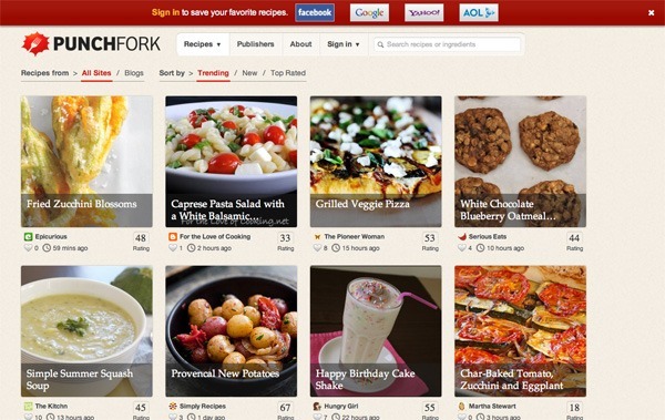
Punchfork aggregates recipes from the top recipe sites and food blogs with a clean, warm look. The homepage features no less than 45 recipes arranged in a 4-column grid and extends with infinite scrolling. The recipe page displays its ingredients in either list view or categorized view—meaning you can see which food items are produce, dairy, condiments, and so on. The page also has a notable emphasis how highly rated the recipe is in terms of tweets, Facebook likes, and stumbles. You can even choose from not one, but four short links you can share.
Foodily
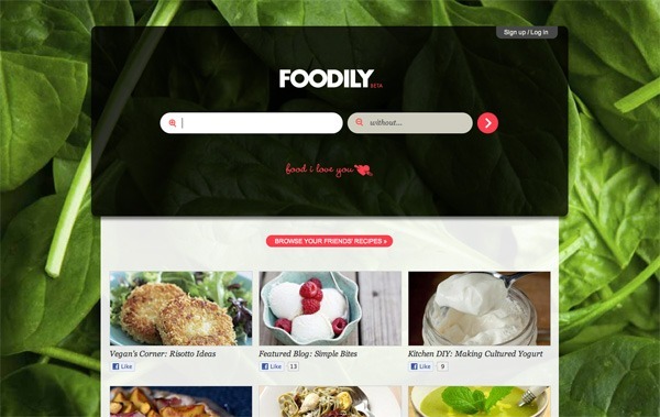
Foodily also has a search engine slant and recipe “glamor shots” in the background, but uses a second “without” input field. Results are arranged horizontally, like vertical index cards, and have nutrition indicators for calories, fat, and fiber. If the recipe doesn’t have a photo, the default graphic reads “Food, I love you”, which is what the name stands for.
Visual Recipes
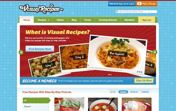
Visual Recipes has many different features in its community, including cooking videos, forums, a blog, and a list of culinary schools in the US. As the name suggests, its selling point is a photo-centric approach to preparing recipes: ingredients and each instruction has a corresponding photo for reference. The recipes tab in the navigation and the footer section feature a mega-menu listing categories by meal, dish, beverage, holiday, and cuisine.
Cookthink
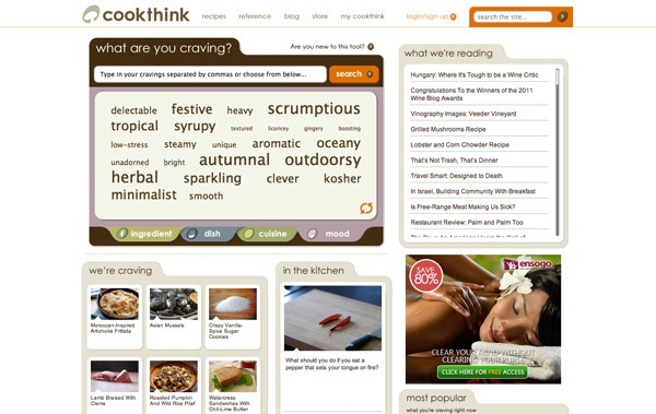
Cookthink compartmentalizes its sections into the digital equivalent of recipe card dividers. You can search by ingredient, dish, cuisine, or mood, with each tab displaying tag clouds of popular keywords you can add into the search box. Results are displayed in a 4×3 grid of recipe photos and titles, which you can hover over to view short descriptions. There’s also a reference section to fill you in on tools, techniques, ingredients, and cooking styles.
Yumit
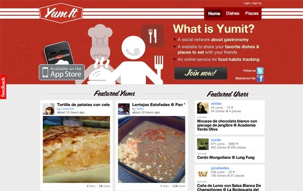
Yumit sports a retro diner look that lets you discover recipes by dish and restaurant. On the homepage photos in each section go from large to small as you scroll lower.
Cooklet
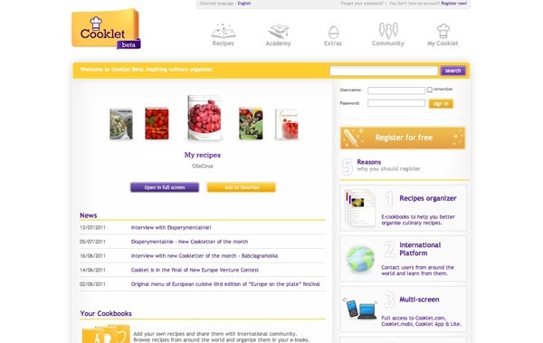
Cooklet seems almost wizardly with its stars and yellow-purple color scheme. Recipes are displayed further down the page while recipe collections and latest news are given higher priority. Aside from its community and academy section, the site also has extra tools for measurement conversion, calorie intake advice, dish timers, and mobile and desktop apps.
Jamie Oliver
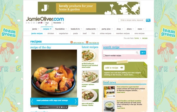
Jamie Oliver uses pastel colors, grungy, textured boxes, and an illustrated background to give the dense site a very light feeling. Featured recipes are shown in slideshows and different panels grouped in threes.
Food Network Canada
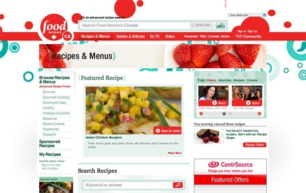
Food Network Canada mixes bright red and mint green, circles and curly braces for its branding and graphic elements, while its section headings are on photographic backgrounds. The search box is wide and prominently featured to the right of the logo.
Disclaimer: I worked on the front-end interface of Recipe Finder.
Originally posted on July 27, 2011 @ 11:55 pm
