Sketch Design is what I call it when a web designer uses techniques that go beyond standard web graphical elements. Your standard elements are buttons and banners that generally try to mimic a real world texture, whether it be plastic or glass or something along those lines. This is a tried and true technique that is certainly the one that I employ the most. However, a newer breed of designer is using a more classic technique.
More Artist than Web Designer
To be a sketch designer, you need to have artistic skill: be able to draw and sketch and have a masterful understanding of color. Contrast that with a standard web designer who finds color palettes, instead of creating them, and who can’t sketch a stick figure, much less anything more complex. If you really think about it, a basic web design is nothing more than a glorified set of rectangles. A sketch design breaks the boundaries of grids, while keeping all of the content elements in focus. To achieve this effect, the designer must be highly skilled and knowledgeable in how to layout a design, such that if the artistic flare wasn’t there, the content would still make sense (obviously, standards play a key role here).
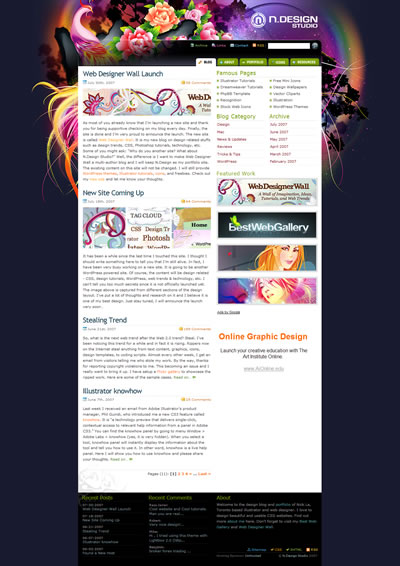
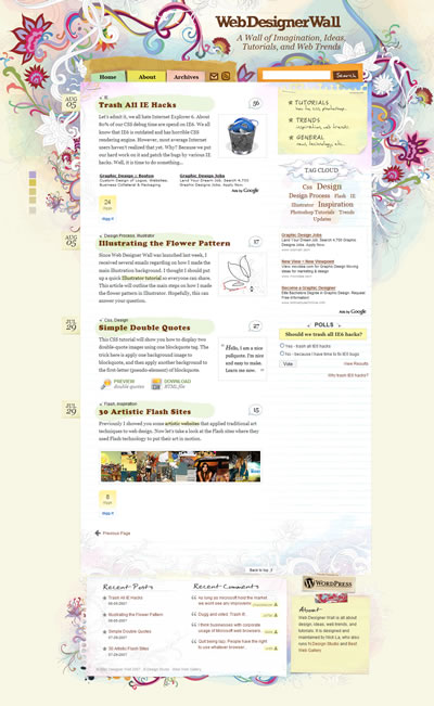
Enough rambling. Let’s take a look at some examples of this style. The first two I have showcased are by a fantastic designer named Nick La. The first is N.Design Studio, his personal portfolio, and the second is Web Designer Wall, which discusses trends in design.


Nick uses many stylish elements in these two designs. Florals are a key aspect of the look and feel. As I mentioned earlier, these elements break the boundaries of the grids that hold the contents, giving them an almost natural feel. Something else that is very popular is the use of paper, which is of course the original medium of sketching!
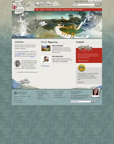
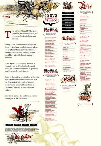
The next couple of designs I want to showcase implement the artistic sketch technique, but in a rougher way. The two sites that I picked are the Biola Undergrad site and JESUS RODRIGUES VELASCO.


The look that is accomplished with the technique here is quite natural. It actually looks like pencil sketching on a canvas as opposed to a website on a screen. The use of textures and crooked elements really set these two designs apart.
To pull off this kind of look, you really have to be quite skilled artistically. I taught myself web design using books and online tutorials. However, to be a Sketch Designer, you almost have to have proper artistic training. Sure, there are scattered tutorials to teach you certain techniques, but to really stand out, you have to do something original; something that you have perfected after a long time of practice. Most designs are a variation of a simple grid (think of all of those bare bones css templates you see on Del.icio.us), but Sketch Design can break the boundaries and truly make a design great.
This post was written by J David Macor.
Originally posted on August 8, 2007 @ 9:47 am