I’m a big fan of Darren’s ProBlogger. I wouldn’t read it as often as I do if I wasn’t. So it struck me as interesting when he recently launched a complete redesign of his website. When someone in the top 5,000 does that, it’s time to stand up and take notice.
That’s what I’ve done. Let’s take a look at the old ProBlogger and the new, side by side.

The color change is a strong one, but only in the way that this new logo really jumps out at you in a way the old one didn’t. I tend to see that as a good thing, some see it as bad. Overall I would say the logo is a good one, and it’s interesting that it puts a bit more emphasis on the “Blogger” in the name than the “Pro”.
Weekly Video Post
I can tell right now that it’s going to get a little frustrating seeing some form of mangled frame-face each time I visit ProBlogger’s home page now. I suppose I’ll get used to it.

Overall Layout/Design

I can’t help but wonder whether or not this new layout is all that unique. Granted, it’s three column and breaks the 800px wide barrier, so it’s clear that the target audience has shifted a bit. But how much of a shift does the redesign show happening?
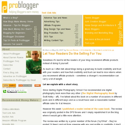
Take, for instance, the photo of Darren displayed prominently on the old ProBlogger. Now, it’s tucked away way below the fold, really beyond the point of even mattering. In essence, he has removed himself, visually, from the site. Does this turn suggest that ProBlogger will be written by more than himself in the future? Maybe not right away, but that time certainly could be approaching.
Search Bar Prominence
It’s interesting to me how the search bar gets (arguably) #1 priority by being up top. I’m used to seeing search bars on blogs much lower down on the page (TechCrunch, for instance) but hardly ever up top anymore. It makes me wonder if it was a conscious design choice or just put there because it fit and the space was available.
Content’s Position on the Page
I do like how the new ProBlogger places content much higher on the page than the previous version did. I don’t like when I have to scroll down (on the single post view, even) just to see the content. So I’m glad that was taken care of.
Height of the Home Page
The method of choice for cruising ProBlogger has slightly shifted as well. The old home page used to have ten full posts (or previews) available on the home page to be scrolled. The new design limits the height and the number of posts to seven, and of them only summaries are displayed. I can’t help but be reminded of when Daily Blog Tips shortened the posts on its front page from their full length to excerpts. That received a good amount of criticism as well, and I would say that’s because people like browsing full entries on the home page of a blog. Personally, the first time I check out a blog, I do one of two things.
- First, I can decided (usually) right away whether I want to subscribe to a site just by reading the first post I see. In that case, I add it Feedreader and skim through the most recent posts that way.
- On the other hand, if I don’t know whether I like it or not I’ll page down on the home page to see what else is there.
The reason for this long digression is to say that the new ProBlogger doesn’t allow for the lazy-scroll browsing the way the old one did. Granted, the cool little “popular” box in the middle of the page is nice, but I don’t know that it carries the same effect.
Honestly, I don’t believe that many blogs could survive the switch that ProBlogger has made. Most blogsites need a format that encourages browsing and pushes it to the forefront. ProBlogger must not.
(Note: You can have the lazy-scroll browsing if you want. Just click through to the “blog” from the ProBlogger home page.)
This is what makes me wonder if ProBlogger isn’t headed away from the traditional blog setup. It’s already taken one step, so it may just be a matter of time. I mean, it already looks like a network site, doesn’t it?
Originally posted on August 13, 2007 @ 11:33 am